Page 1 of 3

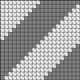
Creating text and then decorating it is often a daunting task, not knowing what colors to use and how to achieve effective results with the resources you have is often hard to overcome. Keeping your text simple but still having it stand out is an art in itself. Here we learn lots of techniques on decorating text like using textures, brushes and patterns. Pick and mix which techniques you use or just try all of them and end up with an image like this.
Preview of Final Results

Decorating Text Photoshop Tutorial
Step 1
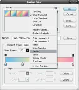 Create a new document, this time with dimensions of 1024x768px then select the gradient tool (G) and open the gradient editor. Click the arrow in the presets box and choose pastels, select the first gradient in this set. Using a linear gradient drag from the bottom of the page to the top, holding Shift to keep it vertical. Lastly change the opacity of this layer to 75%. A gradient is always a strong way to begin a piece like this but does require a texture over it.

Step 3

Step 4
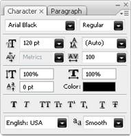
Before you start on the foreground, a good idea is to set up some swatches that you will use regularly throughout this piece. Double click on the foreground color and create a swatch of these three colors; #b5005e, #39d336, #00baff.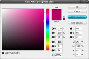
Step 5

Step 6
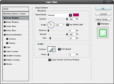
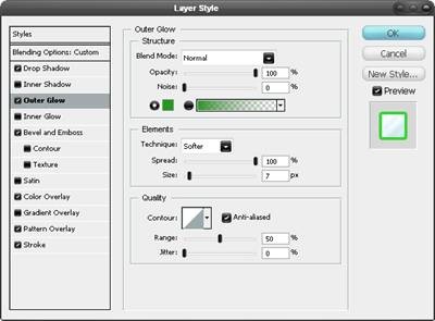
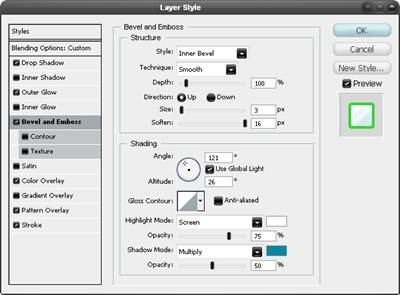
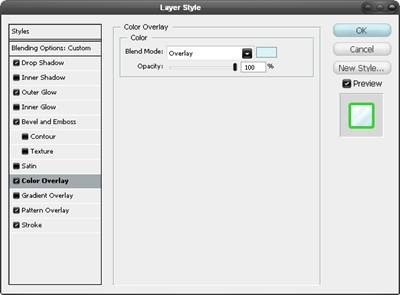
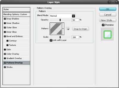
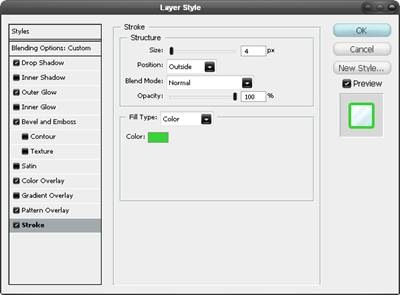
Right click on the text layer and select blending options and add a drop shadow, outer glow, bevel and emboss, color overlay, pattern overlay and a stroke. Use the settings shown below. You will notice that, although we used the drop shadow and the outer glow, we just mimicked the effect produced by a stroke. The blending options can be very powerful when used in this way so take words like drop shadow as a guideline rather than an instruction.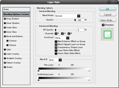
No comments:
Post a Comment